Color token system for enterprise theming
Role
Design Ops Lead
Status
In Use
Year
2024
In order to scale our whitelabel business, our design theming process would need to become a well-oiled machine that could quickly and easily generate full funnel mocks and theming specs for new partners in a fraction of the time.
Current theming process was rife with inefficiencies
Our previous workflow relied on duplicating files, swapping out style libraries, then manually combing through and updating a significant amount of unlinked colors, fonts, and components. This often took days worth of work and left a lot of room for human error.
01
Significant amount of unlinked colors, fonts, and components.
02
No up-to-date template meant a lot of manual piecing together.
03
Duplicating previous partners files and features leads to a lot of brand leakage.
04
No clear source of truth meant a lot of time info gathering and cross-checking.
05
Unclear color system led to a lot of one-off color customizations per partner.
The lack of clarity and structure for our platform was the source of many cascading issues.
This was a newer platform of ours and we were building the plane as we were flying it. Working in such a reactive manner was beginning to show critical growing pains.
Initial internal discovery phase uncovered a lot of insights
With my Design Ops teammate, we interviewed developers, design systems leads of our parent company, and staff designers for business development and design systems. We wanted to understand current practices, pain points, and how we might be able to better meet their needs.
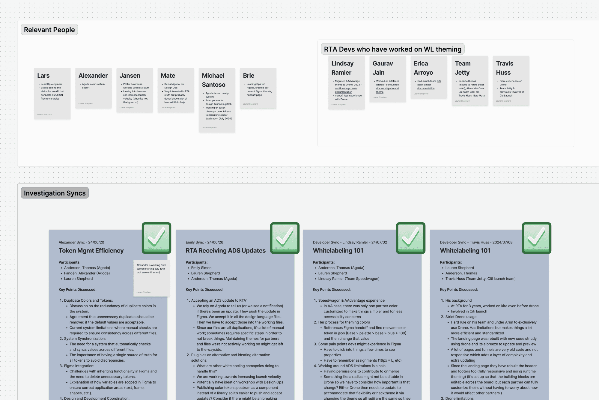
Documentation from a portion of our discovery interviews
From these discussions, I began mapping out our current theming process
This included everything from ownership at certain points, to pain points, to suggested solutions. This step was important for organizing our findings and giving us (and others) a top-level understanding of what we’re working with, as well as potential avenues for change.
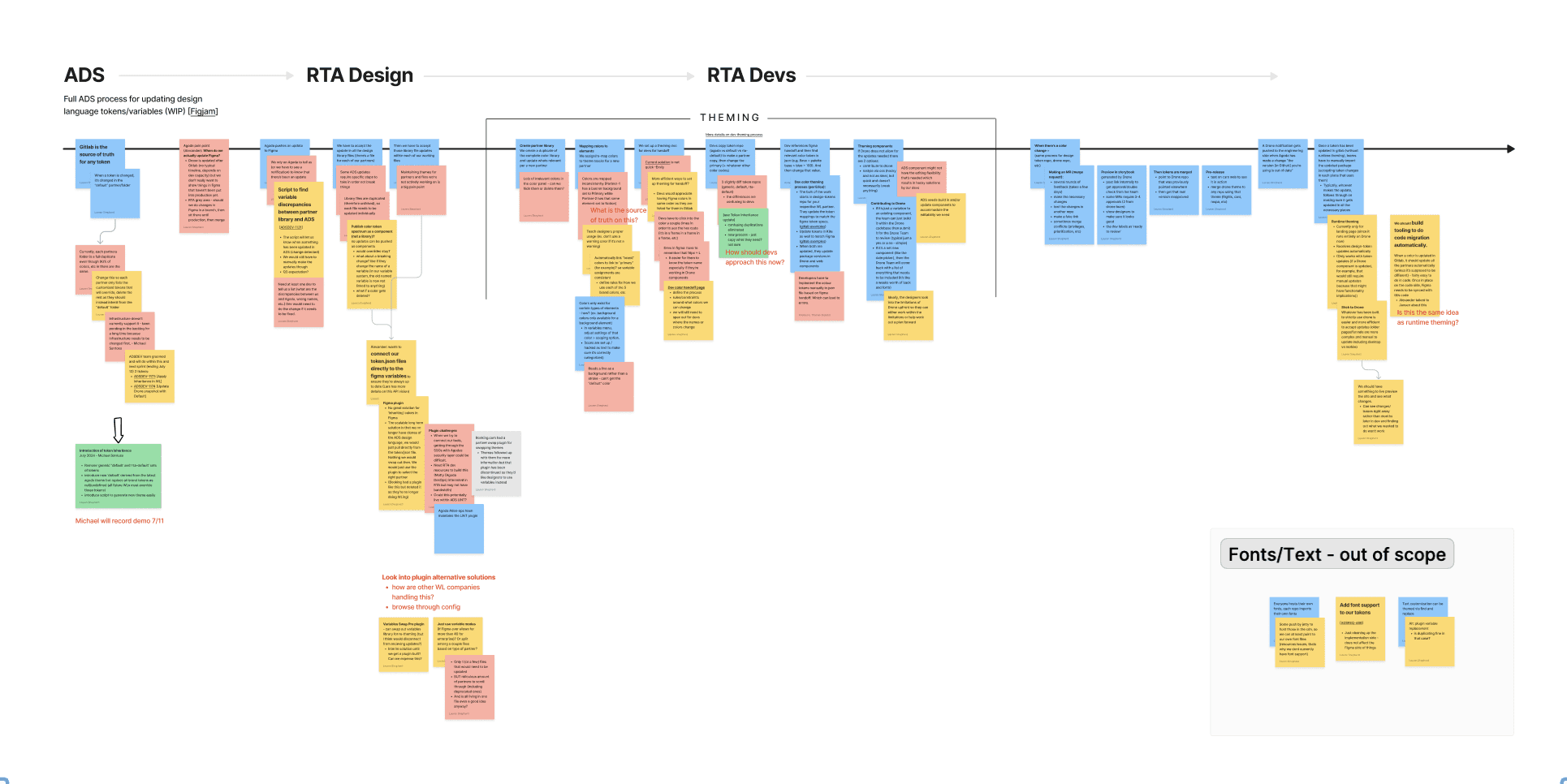
Mapping of the theming process and our discovery findings
Lack of automation was hindering our ability to scale quickly
Our discovery process made it clear that excessive amounts of tedious manual work were slowing us down. Any opportunity to automate a step of the process would be a step towards alleviating our pain points.
Discovery
As the white-labeling branch of our parent company, Agoda, it was crucial for us to work closely with the more established teams there. In parallel, we were exploring how using Figma’s new variables feature could take our practices to the next level by being able to easily swap out themes as needed.
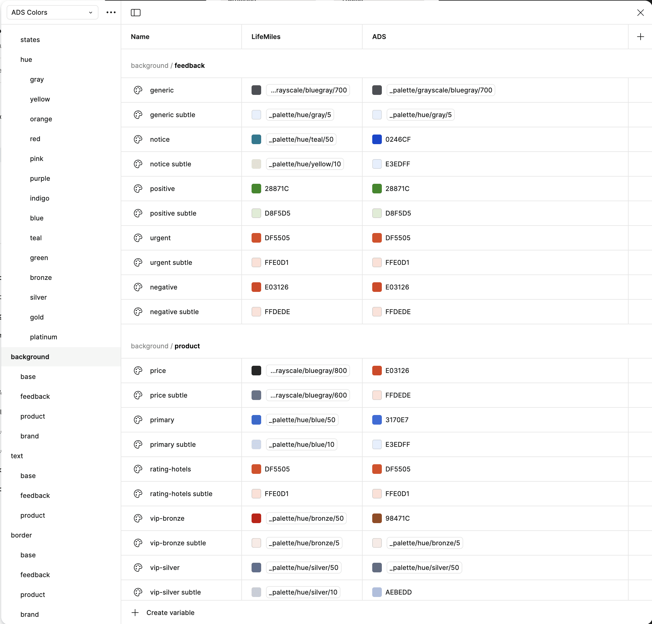
Tokens set up as a variable system with different partners accounted under different modes.
Opportunity
Agoda was already making use of a robust design system and set of color tokens. While this worked great for their single brand, white-labeling for a variety of partners came with a unique set of considerations. Our work involved figuring our how to align with their existing work, but also building upon it and adapting it for our unique white-label needs. This included understanding accommodations Agoda is willing and able to make, co-opting and renaming certain sets of tokens, reducing redundancy, working with developers to better align with what’s in production, and exploring features and plugins to maximize automation.
An example of an automation tool I was able to implement to help eliminate a significant portion of tedious manual work.
Accessibility
A major initiative for us was to ensure color contrast always meets accessibility standards. Each partner came to us with their unique set of brand guidelines. I documented a process for our team that involved identifying partner colors and making sure all hues we generate fall within certain lightness ranges. This was crucial to ensuring that every instance of a token’s use throughout the funnel showed with enough contrast. If not, we’d be able to know early in the process if we’d need to advise our partner on more accessible alternatives.
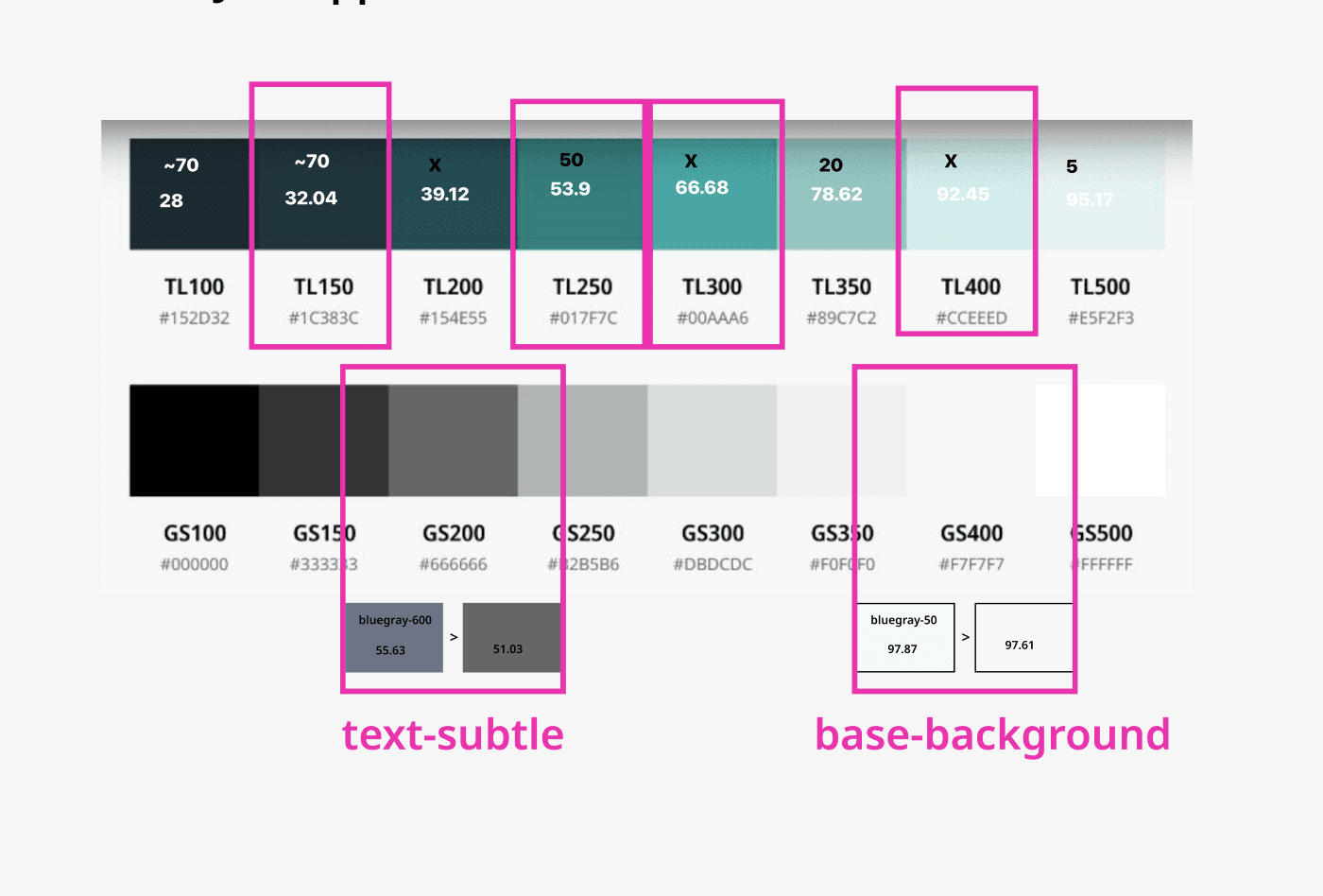
An example of partner branding marked up to test for hue lightness.

Color worksheets I created to bring partner colors into a standard set of hues and to test for accessibility.
Handoff
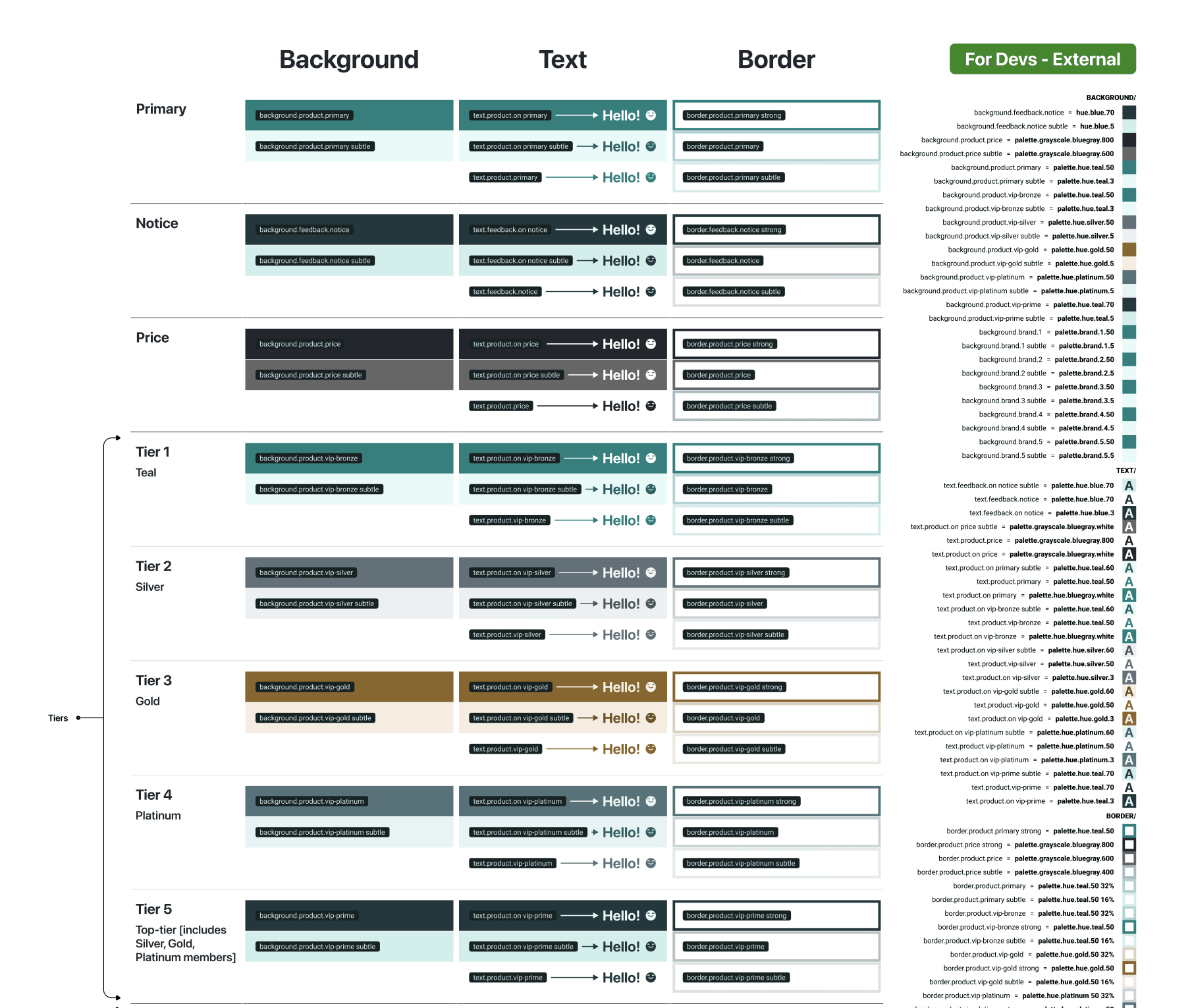
To cut down on manual work when it came to handing off tokens from design to development, I created documentation components that would automatically inherit color variables and would be configurable based on a partner’s unique needs.
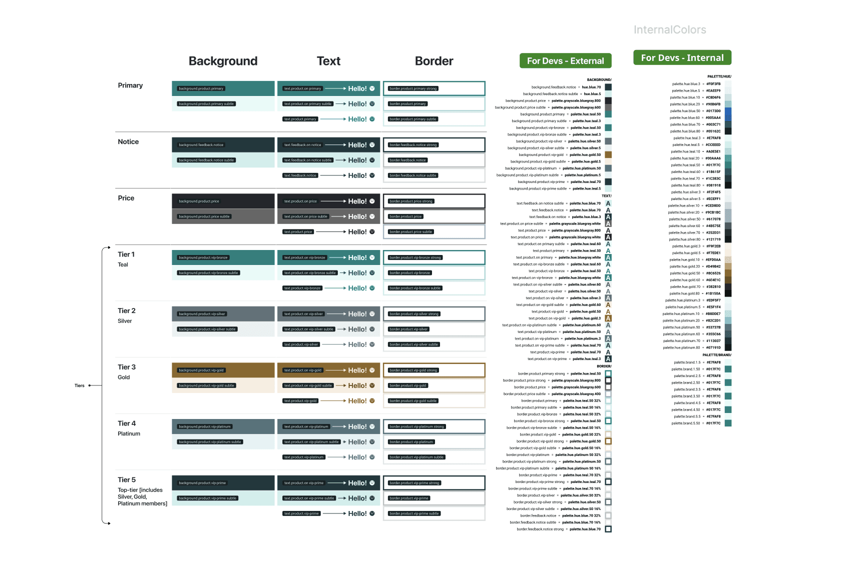
Handoff documentation components I created for designers and developers to quickly understand partner overrides.
Outcomes
Time spent theming for each partner was reduced by more than half and helped establish standards for all launch teams, particularly for the design team. We also experienced a significant reduction in handoff friction between design and development by standardizing documentation. We also helped to establish clarity for PMs and the commercial team in terms of our system capabilities, which in turn reduced a lot of insignificant one-off customizations.
Retrospective
While this work on color tokens proved to have an impact on multiple internal teams, it was just one piece to a larger system overhaul. I was only able to see through these process improvements during two launches after this work was established, so while we were able to see some impact in that time, a more longer term analysis and follow up interviews would’ve been my next goals.